Dynojet.com Revamp
Quick Navigation
- UX Design Process
- Problem
- Goals and Objectives
- Users and Audience
- Content Strategy
- Wireframes
- Hi-Fi Mockups
- Design System
- Retrospective / Learnings
Project Overview
Dynojet Research, Inc. is the world leader in the development and manufacturing of performance enhancement products for the Powersports industry. To increase its presence in the e-commerce arena and create a unified customer experience, I worked with Dynojet to redesign and centralize all of its five diverse product website properties under one roof, driven by a robust, redesigned e-commerce system.
Role
Product Manager / UX Designer
The Old vs. New Process
Over the years, the process for creating a website would be very reactionary, without following any specific process and product managers wanting each product line under a new domain. That eventually led to a disjointed approach, which produced, at one point, a total of 10 different websites with very little interconnectivity and, at times, little consistency. This approach not only created a website maintenance nightmare but kept accumulating user experience debt.
The goal of the new website redesign was to take a different approach, first, by establishing a UX process that we would follow, second, by making sure key stakeholders understood the importance and benefits of adhering to it.
Initial Constraints
Before the project kick-off, I put together a UX Design process so that everyone involved in the project could understand, in detail, all the steps involved in each phase. A high-level diagram of this process is shown below. Each step on each phase was further broken down and explained so that everyone involved in the project could reference it, throughout the duration of the project and afterward. Additionally, before this project, all departments kept track of documentation and project plans in silos, that made cross-department collaboration a hassle. To smooth collaboration between departments and keep better track of this and other projects, I set up Confluence and Jira, as a result, this improved the collaboration process between all departments dramatically.

A note on MVP. The MVP definition will depend upon the product and resources available.
Problem/s
Having several product websites under several different domain names over the years led to poor user experience. Here are some critical problems discovered under the old website structure:
- When buying a product, customers are forced to hop over several websites making the customer support and purchasing experience very frustrating.
- When buying a product, the customer isn’t sure if certain products fit their vehicles often having to send an email or call support to verify.
- When accessing product support such as software downloads, install guides and other documentation, the customer is forced to visit multiple websites to find what they’re looking for.
- Because there is no easy way of searching for products, product support materials such as downloads, product manuals, and other helpful website content, the customer spends too long navigating through the websites, often calling or emailing support for help.
- Product copy and visuals confuse the customer or often don’t provide enough information for the customer to make an educated decision about a product purchase, so they’re forced to call customer support or send an email for help.
- Customers have a difficult time identifying which products are made by Dynojet due to visual brand inconsistency.
Goals and Objectives
- Unify all websites under a new e-commerce/cms system to simplify the shopping and customer support experience
- Personalize the shopping experience around a customer’s vehicle
- Redesign the site information architecture to improve usability and findability of products and other important customer support items such as downloads and manuals
- Develop a content strategy to rewrite product copy and redo product visuals to create greater consistency and better visual appeal
- Overhaul the company brand identity and integrate with the new website, apps, product software, product packaging, and other marketing materials
Users and Audience
Based on past market and sales user research data, internal collection of user data, user surveys, product registration information, and web analytics (CubeYou, Google Analytics, Similar Web), the following User Personas were put together based on real users (names and photos have been changed).
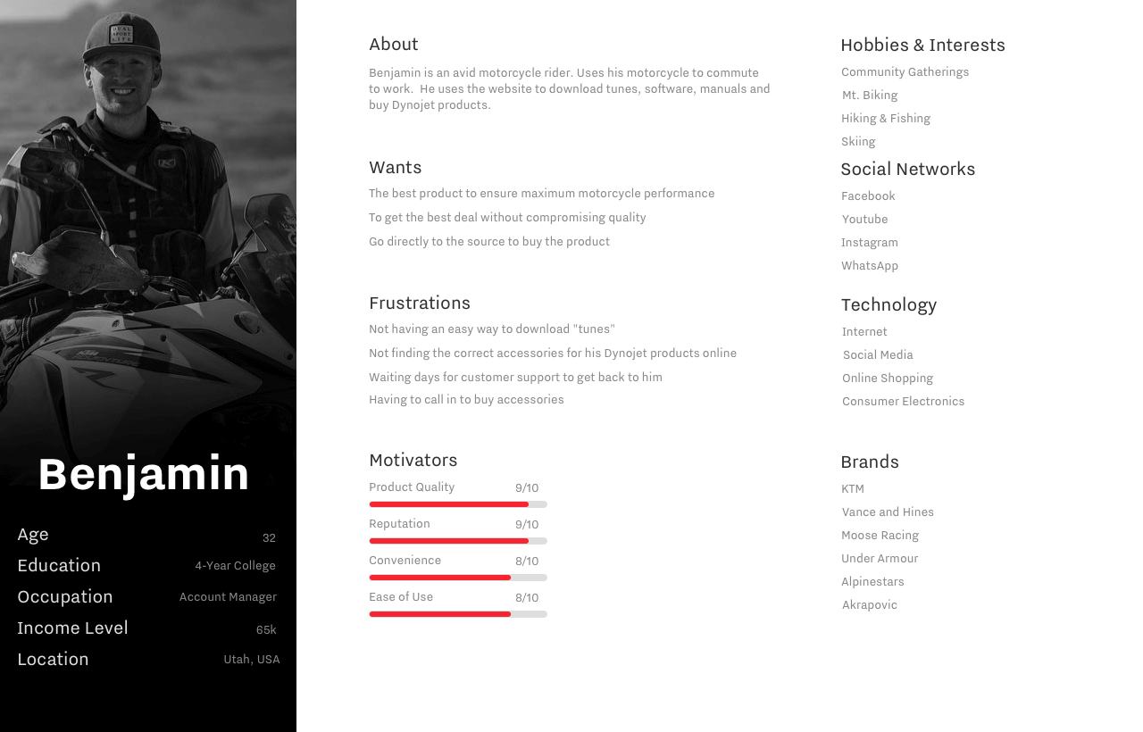
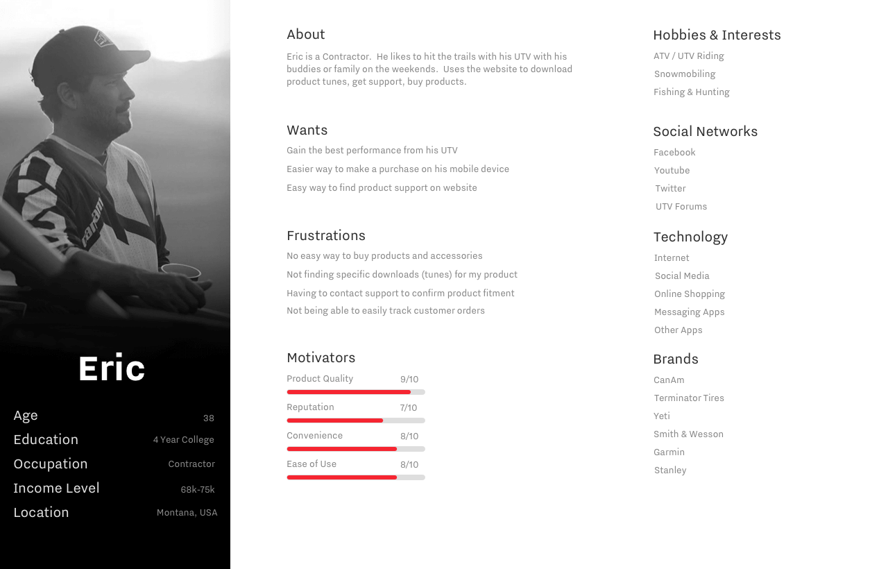
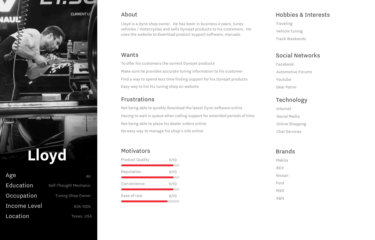
There were a total of three Personas. These customers ride anything from Harley-Davidsons, Sportbikes, Dirtbikes, to UTV / ATVs and can generally be placed under two segments Trail (Off-Road) vs. Road (Street). One other category is diagnostics equipment consumers. While these customers might also be Powersports enthusiasts, they’re usually more interested in getting the best return on investment from the Dynamometer products they buy so they can generate income. Across the product lines, they all expressed similar desires and frustrations as it relates to the website experience.
Content Strategy
One of the first things on the list after defining the problem and conducting user research was to draft out a thorough content strategy with the goal of drafting out a solid content plan. Unsurprisingly, this led to several key findings: product, vehicle, and customer data lacked integrity. Also, branding wasn’t consistent across all of the website properties, product packaging, product software, and mobile apps. Moreover, because many departments worked in silos, we had a ton of critical data that needed to be consolidated. The solution was to embark on a massive data cleanup process.
The content strategy included the following:
- A clear assessment of all of our internal and external data sources. Consolidation, clean up, and migration of critical product and customer data into the new platform.
- A complete redo of most visual assets for both photo and video, and company rebranding.
- Standardization of vehicle, and product data based on PIES and ACES industry standards.
- Redo of product copy (descriptions, features, specs) based on our customer, marketing, and SEO needs.
- Procurement of a product review management software.
- Creation of a new product knowledge base to house our how-to documents.
The content audit and content inventory allowed me to draft the first version of the new site’s information architecture, shown below. This gave me a good idea of how the critical features/pages needed to be integrated with the wireframes.

The Design Process Begins
I used Sketch to draft out the first wireframe iteration. I set up Invision to collaborate with stakeholders and gather any feedback. In addition, I set up the Invision Design System Manager to store design system assets. It was our very first time setting up a Design System so some stakeholders needed to be convinced and informed of the benefits of having one for the company.

Collection of Wireframes Used to Create HiFi Mockups
HiFi Mockups
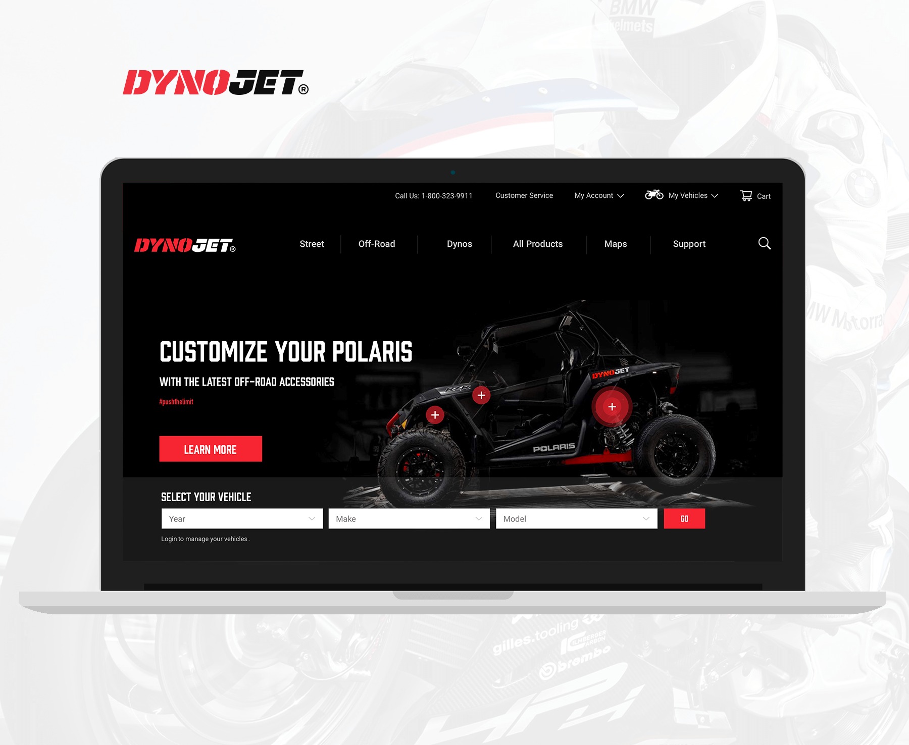
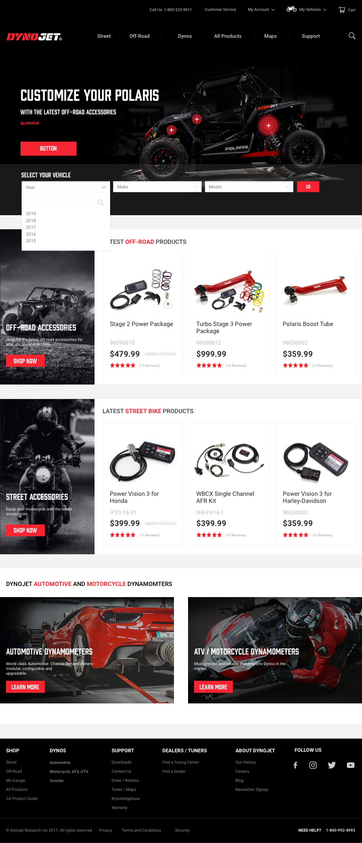
Home Page
Emphasize the vehicle selector, and show the latest product for each main category – Off-Road, Street and Dynamometers.
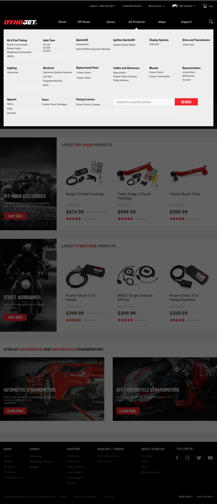
New Menu Structure
The menu structure closely reflects what was drafted on the IA and breaks down all products into respective categories which can be expanded as the product line grows. This also provides the customer with a clear idea of what the products are used for.
There is also a search option should the user want to quickly look for a specific product.
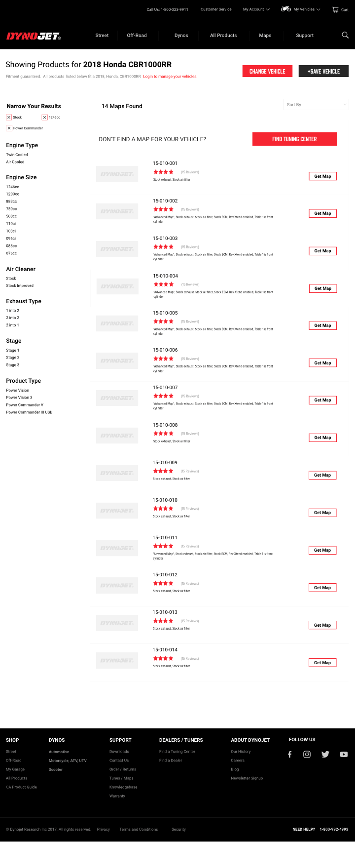
Maps / Tunes Product Category Page
This product category page takes into account a core user need: the ability to filter Maps / Tunes quickly via the layered navigation to improve findability. Adding a Map / Tune search feature and testing its effectiveness would be the next feature.
The user can easily see their selected and even add their vehicles to their garage. Because the vehicle selector is omnipresent, making a new selection is rather a quick process.
The list layout proved much more effective than the grid layout.
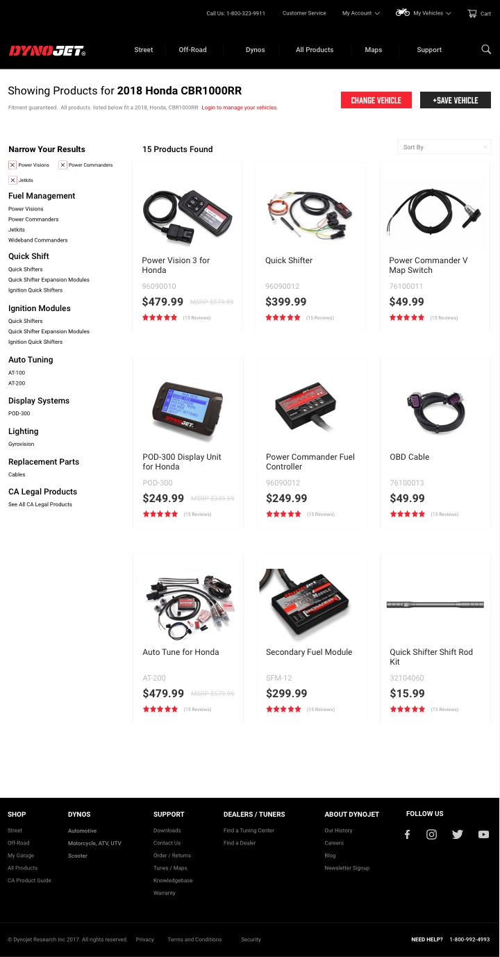
Product Category Page
On this product category page, a user can see all the products that fit his/her vehicle right away. Typically the number of products don’t exceed 15. For that reason, the grid layout is set to display 15 product by default. The user can then narrow down their search by product attribute using the layered navigation on the left.
Because some of these products offer customization options or the ability to select another product variant, there is no feature to add a product to the cart on this page. We need the user to continue reading about the product on the product details page and customize his/her product or bundle his/her product with other accessories.
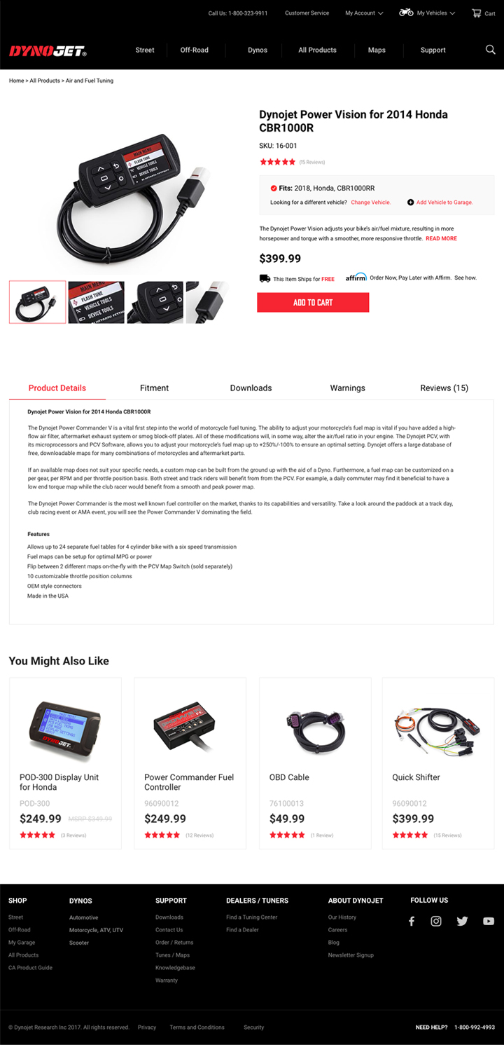
The Product Page
This shows the layout for a simple variant product (one with no customizations or bundle options).
The goal with this product details page was to highlight some key features the users expressed a desire for – ability to confirm vehicle fitting to a product, ability see detail description of the product, as well as any related any downloads or warnings associated with each product.
To not distract the user from any purchasing intent, the “You Might Like” products are displayed at the bottom of the page after the Product Details.
Design System Preview
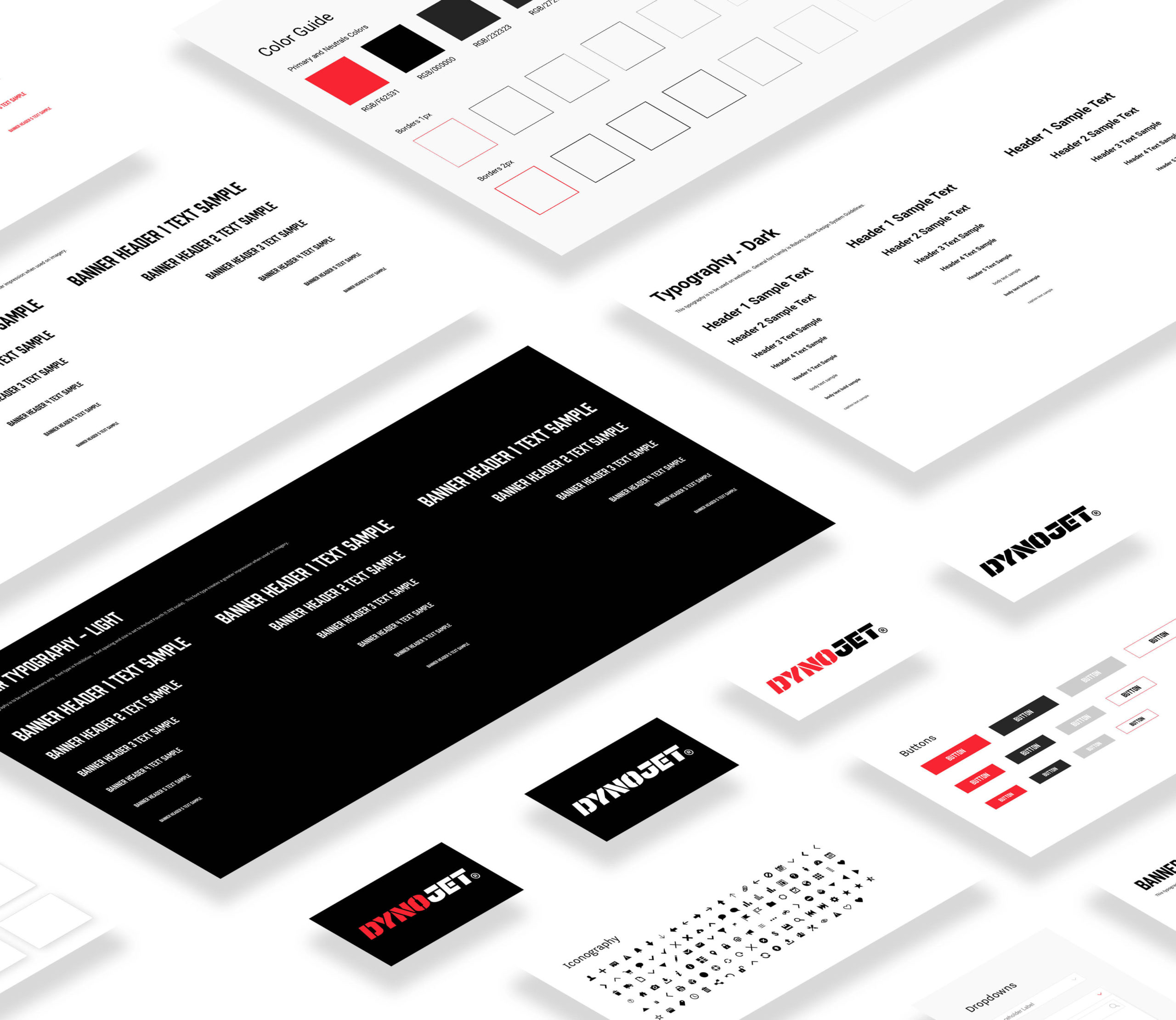
Design System Used as a Guide to Create Mockups
Retrospective / Learnings
Because of the sheer amount of UX and technological debt accumulated through the years, this project proved very challenging. This project allowed me to wear many hats, including that of a developer at times, so that made it a challenge to give certain aspects of the UX process the attention I felt was needed, especially user testing.
While I made good strides establishing a UX process for the organization and applying it to this project as well as gaining support from upper management, there is quite a bit of work that needs to be done to reap all the benefits from the proper practice of UX design. UXD to this organization is still very new; it’s not yet organizational it’s departmental. UXD needs to be holistic and applied across the product line, not just to certain digital goods. Ultimately, creating products that users truly enjoy and want bodes well for the bottom line.
Don Norman said it well:
“No product is an island. A product is more than the product. It is a cohesive, integrated set of experiences. Think through all of the stages of a product or service – from initial intentions through final reflections, from first usage to help, service, and maintenance. Make them all work together seamlessly.”